The book and its cover: historical fiction cover art
by Bethany Latham

The cover for Clare Clark’s Beautiful Lies, showing the influence of Art Nouveau on its design.
Pick up an old book, say an Edwardian-era printing. The cover may be plain, cloth-covered board or tooled leather with gilded type. Regardless, it’s a slate upon which are written only a few words: a title, perhaps an author. Otherwise, the publisher has offered no preconception of what should be inside, beckoned us with no images of what it thinks we wish to experience. The author’s words are allowed to speak for themselves.
Things have come a long, long way.
In a fiercely competitive market, publishers use all the tools at their disposal to sell their wares – cleverly edited review blurbs and glowing recommendations from similar authors plaster the front and back of books. But as visual creatures, publishers entice us primarily through the images created for the books’ covers. In order to target specific audiences, distinct cover styles have developed for historical fiction’s multiplicitous subgenres. How these covers are created varies by publisher. Kristine Noble, Creative Director for Kensington, notes that an art sheet providing plot summary and other pertinent details is generated by the editor assigned to a particular book; the design team discusses how best to market the book, and the cover is crafted around these discussions. Sarah Cardillo, Senior Managing Editor for Sourcebooks, says that “it really comes down to content and category…what do other books on the shelf that are about the same time period/people/locations look like?” A course is chosen: an original photo shoot or stock images (fine art, or sites that specialize in “historical” photography specifically for book covers). For Cardillo, “the process is unique to the book, the subgenre, the designer, or even the author.” Author participation varies; some houses leave the author out entirely, most will at least solicit input, but in no case does the author have final say. Paul Higdon, Art Director at Bethany House, notes that he loves involving authors, working with them: “We want to hear what they’re thinking; it really informs us and sometimes the direction we take.” Higdon also says that many authors, surprisingly, “have no idea” what type of cover they’d like to see for their works: “they say they trust us and don’t want to get in the way.” Cardillo adds that input from the author is essential to ensure the details are right: “The more information they can provide us up front, the easier it is to get the cover right the first time…the era, the physical characteristics of the people, historically accurate locations and points of interest in the story.”
This hurdle of historical accuracy can easily send an HF cover sprawling. Most publishers take steps to stay within period, but the romance genre is the most frequent offender – temporally inaccurate clothing/makeup/hairstyles, decidedly modern heroes/heroines, and inappropriate backgrounds abound. Romance novelist Joanna Bourne notes on her website that what she hates about historical romance covers is their boring similitude: “we have a passel of women with their clothes falling off. Sometimes, men with their clothes falling off. Sometimes both. Forgettable covers.”(1) This weakness from an aesthetic perspective, however, can be a marketing strength, and it showcases the fact that cover art, for all that it can be evocative and beautiful, is designed around a single purpose: not reflecting the book inside, but selling it.
Romance novels intentionally pursue a similar look, but there’s also unintentional duplication to be found. The problem is primarily a financial one: if publishing houses use stock images, unless they’re willing to pay for exclusive rights, it’s not unusual for another publisher (or 10) to use the same image. The result is an interesting gallery of different covers with the same artwork. (2)
Author Elizabeth Chadwick has written that, in the past, HF covers were “rife with paintings from the period in which the novel was set, or pastiche imitations.” (3) Higdon sees the progression since then as a cyclical one: “the 1990s saw the peak of illustration, painting and portrait covers, which evolved into illustration montages; this was replaced by photorealism, from there into photo montages, and finally photo manipulation.” Today, many HF covers are photorealist variations on a theme: a pretty girl, a beautiful dress, and an eye-catching landscape as backdrop. Higdon believes that the next movement in HF artwork is a return to illustration – a stylized look that bridges the gap between illustration and photorealism.
Images are usually the most important feature of cover art, but typography also plays a vital role; occasionally, it can be the primary design element. HF cover typography must feel period-authentic while providing readability, a difficult proposition. The solution is to use a historically-appropriate font, but modernize some letter elements to enhance readability. Covers are designed for an in-person, in-store browsing experience, but they now must also, as most designers put it, “look good small,” an additional burden brought on by Amazon and its online friends. The metadata is paramount – available for all to search and see – but covers should still provide recognition and feel at thumbnail size and 70 dpi.

Philippa Gregory’s The Other Boleyn Girl, which pioneered the “headless bodice” motif.
Cover designers would love the freedom to simply create art, but the market doesn’t support this kind of innovation. Thus, current trends in HF reflect innate restrictions: creative, but within prescribed representational boundaries – namely instant recognition for the subgenre and period. This is the still-rolling “headless bodice” bandwagon that began with Philippa Gregory’s archetypical The Other Boleyn Girl in 2001. The idea is that decapitating the model gives period structure (as well as highlighting clothing to feed the urge for textile porn that permeates much of HF) but still allows us to imagine the hero/heroine as best suits our fancy.

The cover for Douglas Jackson’s Defender of Rome features an indistinct protagonist with a focus on armor.
The equivalent in “male” HF is what HNR’s Book Review Editor Sarah Johnson calls “warriors and weapons” – an emphasis on armor, weapons, ships, and the occasional well-muscled hero. This is one area where there’s more disparity between US and UK editions. According to UK publishers, masculine, weapons-focused covers sell better in the UK than the US, where a softer approach is often favored. Kayleigh Clark and Erin Galloway, publicists for Penguin Group’s NAL/Berkley, say that it’s difficult to pinpoint the differences in the US and UK markets, but there is great variety in the images “necessary to attract the consumer in each market. So we rarely use the same cover.”

The Pleasures of Men by Kate Williams. The book’s UK and US covers demonstrate the changes in look and feel that come with an attempt to appeal to different cultural demographics.
Take, for instance, the UK and US covers of The Pleasures of Men by Kate Williams. The UK hardcover features a high-collared Victorian woman, hands primly in lap, against sedate wallpaper. But the colors are rich and bold, she’s pale as death, and her lipstick mirrors the hue of the blood congealing on the knife she holds in her lap. One instantly knows this is a dark work (a murder thriller), depravity oozing out the edges like flesh escaping a too-tight corset. The US version, by contrast, is a close-up of the bare back of a chemise-clad girl, strands of hair escaping from her loose braid. The colors are neutral, and the overall impression is gentle and sensual – this could be a romantic, or perhaps tastefully erotic, literary novel of indeterminate period, for all its cover divulges. The UK gets an unsettling image more accurately reflecting content, and the US a toned-down, ambiguous cover. There are cases, however, when covers are designed to provide cross-gender and cross-cultural appeal, such as the crime fiction of C.J. Sansom which, as Jane Wood, editor at Quercus, notes, “is simple yet still sumptuous, with great lettering and male/female crossover.”

A Change of Fortune by Jen Turano.
The original headless bodice artwork was full-front and close-up. Recently, some faces are being added back in, usually to communicate a specific emotion, such as Jen Turano’s A Change of Fortune’s cover – the model’s wry expression was chosen to convey the book’s edge of humor, make female readers feel as if they’d like to have her for a friend. Overall, however, the trend has been to keep protagonists indistinct, though how this is done has evolved. They’re now shown in silhouette, extreme profile, from the back and/or a distance, or highly stylized in a manner consistent with a particular artistic movement (Art Nouveau, for example). Alternately, if the novel’s center is a strong sense of place, architecture and landscape will figure largely in the composition, with protagonists almost an afterthought, if they appear at all.

Edward Rutherfurd’s Paris cover focuses entirely on landscape and architecture, to emphasize its sense of place, rather than protagonists.
This focus on place is also true of HF mysteries, which tend to be highly atmospheric, a fact reflected in the emphasis of their cover art – the ambiance and environment, whether it be a Gothic manor or the fog-steeped streets of London, most often permeate their covers. Since the majority of mysteries occur in series, an attempt is usually made for a uniform look throughout a run, though it’s not always possible as trends evolve (e.g., see Anne Perry’s covers). The usage of unambiguous illustration styles, especially Art Deco for Jazz Age mysteries, is an interesting development that allows the artwork to give the suggestion of an environment and protagonist, but still, as Higdon notes, “create a realm where we can leave it totally up to the imagination of the reader.”
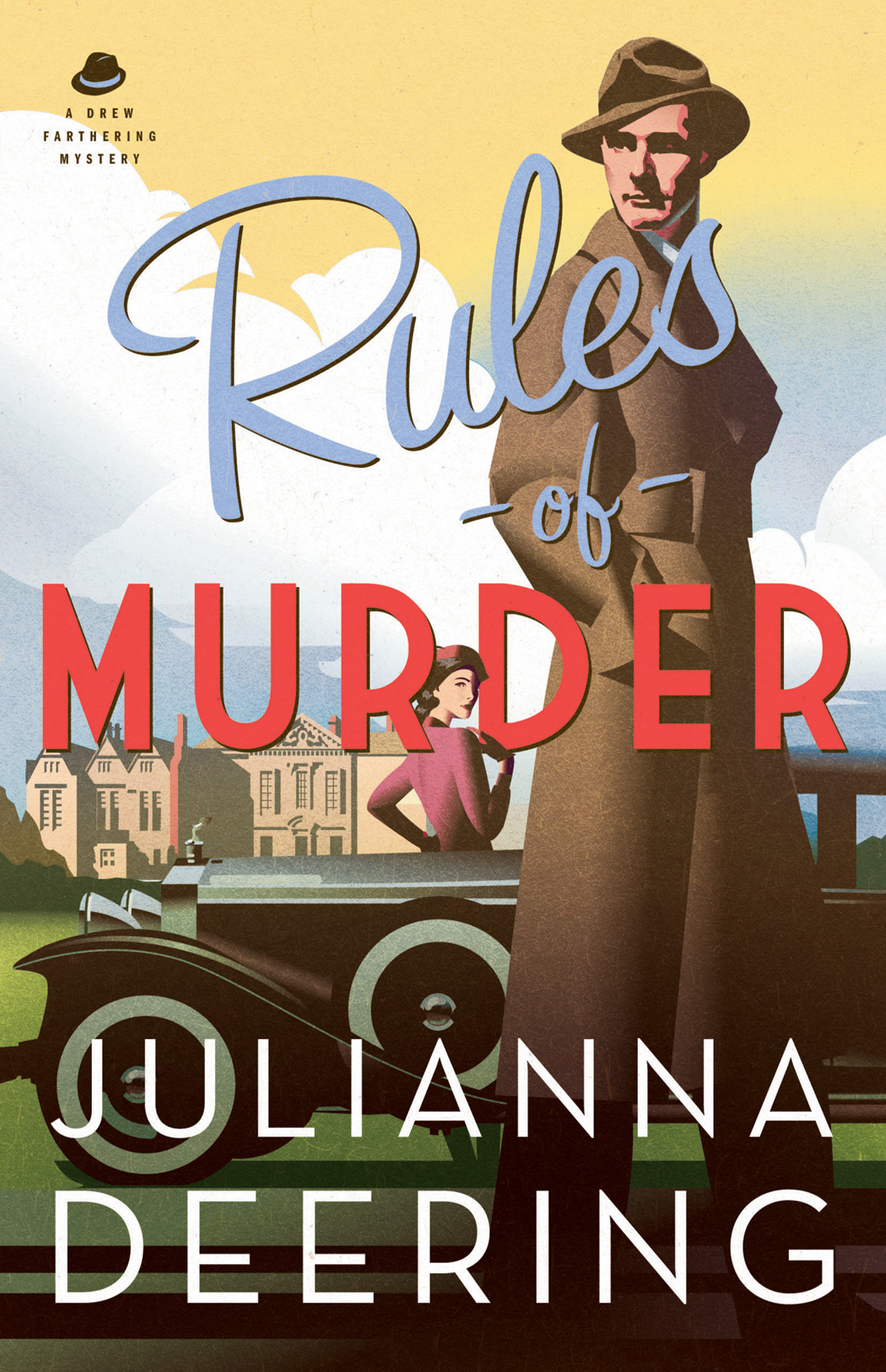
The cover for Rules of Murder by Juliana Deering shows the popularity of stylized Art Deco illustrations for Jazz Age mysteries.
And this realm of imagination is where some truly innovative covers arise, slipping the surly bonds of genre representation. In an informal poll (i.e., I asked a dozen people in the industry as well as fellow readers) of favorite HF covers from the past few years, from the thousands of choices available, the same titles appeared, with descriptors such as striking, imaginative, daring, and fresh. What these titles have in common is that they’re all illustrative rather than photorealist, but there the similarity ends. Clare Clark’s Beautiful Lies has, as Cardillo calls it, “uniqueness on shelf,” due to what Johnson describes as its “elegance, deep color palette, excellent sense of the Victorian era, and the mystery and sultriness” it conveys of its heroine; it’s also an arresting example of Art Nouveau influence. Another frequent mention is Patrick deWitt’s The Sisters Brothers, whose hardback cover was created by Portland artist Dan Stiles.

The illustrative cover for The Sisters Brothers by Patrick DeWitt, designed by artist Dan Stiles.
It struck me so forcefully the first time I saw it, I actually did a double-take; bold color contrast combined with the almost mod quality of the illustration and the “vase or two faces” (in this case skull or two gun-toting cowboys) make it truly unique, especially for a literary Western. (A subgenre, I might add, that interests me not a whit, yet I was tempted to read it based on the cover alone – exactly the reaction publishers seek.) Two other illustrative covers that rate an honourable mention are The Hangman’s Daughter by Oliver Pötzsch and The Night Circus by Erin Morgenstern.

The Night Circus by Erin Morgenstern
The former has an almost Edward Gorey-esque quality while the latter features more elegant lines. The 2010 Doubleday hardcover, which I own, is lovely, its focal point stylishly rendered circus tents held in the palm of a hand – reflecting the fact that the night circus of the title is conjured into being by magicians. Later editions chose to completely subordinate this same image by placing two Victorian silhouettes, a man and a woman, in the foreground, to emphasize a “love story” – not the novel’s center, but an appeal to a certain demographic. This edition features a die-cut cover complemented by black tipped pages and elaborate end papers. Both editions are gorgeous and, as does The Hangman’s Daughter, they feature primarily black and white palettes highlighted with a pop of bright red, with carefully selected typography to add the finishing flourish. Like the The Sisters Brothers, neither title’s artwork reflects the actual period of the story contained within, yet all three work, and beautifully.

The Hangman’s Daughter by Oliver Pötzsch
So the next time you judge not the book, but its cover, think about how far things have progressed in the world of bibliographic artwork in the past hundred years. Think about why you stopped to pick that particular tome from its brothers on the shelf or in a search results list. Ponder on what emotions the publisher was trying to evoke by the art chosen, and the multitude of editors, art directors, photographers, costumers, illustrators, graphic design artists and marketing gurus who influenced what you’re seeing. And perhaps most importantly, consider the preconceptions you’ve instantly formed about what you’ll experience…before you’ve ever turned the first page. This is the power, beauty, and sometimes misfortune of historical fiction cover art.
Notes:
1. Bourne, Joanna (2012). “Romance Covers … What’s Wrong with Them.” http://jobourne.blogspot.com/2012/05/this-is-what-i-hate-about-romance.html
2. Johnson has devoted a section of her blog to duplicate cover art, with new additions made periodically; see http://readingthepast.com/gallery/reusable-covers.htm
3. Chadwick, Elizabeth (2006). “Under the Influence of the Jacket.” Solander, v. 10 (May): 19-22.

Bethany Latham
About the contributor: BETHANY LATHAM is a professor, librarian, and Managing Editor of HNR. She has written a book, Elizabeth I in Film and Television (2011), and she also publishes in various scholarly and popular journals, as well as writing for EBSCO’s NoveList database. She serves as Internet Editor and a regular reviewer for Reference Reviews.
______________________________________________
Published in Historical Novels Review | Issue 64, May 2013